Colour Theory in Bird Photography
Colour is one of the most important aspects of photography. Photography is all about light, and colour is a big part of that. Usually however, we don’t think about colours when we photograph birds. We care more about simply getting the shot. However, bird photography is no different that regular photography, so here are some tips for using colour theory to take bird photography to the next level.
A large part of using colour well in bird photography is picking the right background to suit the subject. Birds of different colours will be better on different backgrounds. For example, compare the two photos of a robin below:

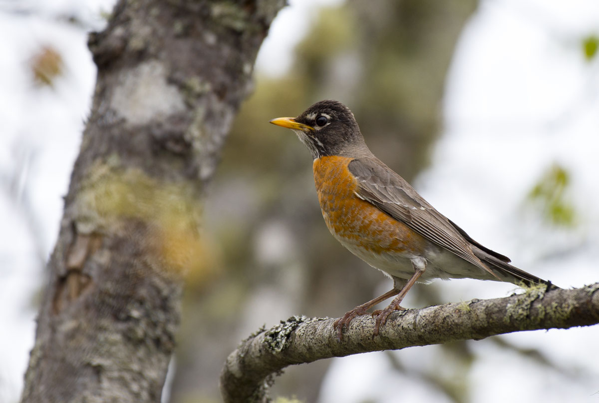
The first shot is far more attention grabbing, despite the second having more detail and a larger subject. This is because the reddish-orange chest of the robin contrasts more strongly with the vibrant green leaves in the background than it does with the tree trunks and cloudy sky of the second image.
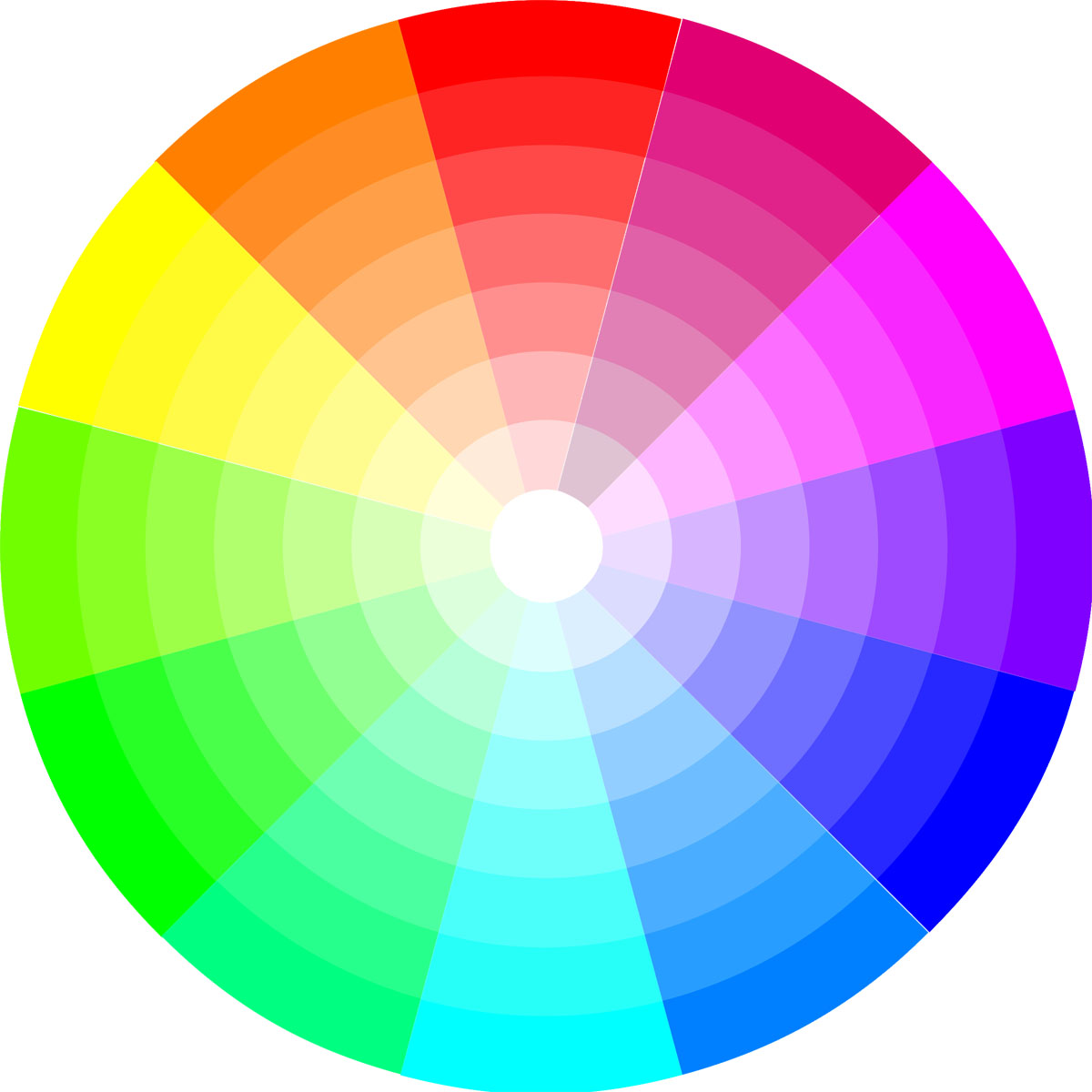
Green and red are complementary colours, falling on opposite sides of the colour wheel. This means we notice their contrast especially well, and find it pleasing. Purple and yellow, and blue and orange are also complementary colours that you can look for in your shots. Green and red is especially useful though, since it’s very easy to get a green background for birds by shooting them in trees or near other foliage, and there are several fairly common species bird with some red on them in most parts of the world.
Blue and orange is also a very common colour combination in nature. Orange leaves in the fall are perfect for bluejays or other blue birds, whereas the blue background of the sky actually works pretty well for many birds that have some orange colours. Even if they aren’t vibrant orange, such as a more brownish colour, there’s still a bit of a nice colour contrast there.
A good way to develop your eye for colour and test your photos is to blur out the details in an image with a gaussian blur. Blur it enough to get rid of all the fine detail in the image, and all you’re left with is colour, so it’s very easy to compare photos and judge which one uses colour better. For example, here are the two robin photos from earlier, but blurred.
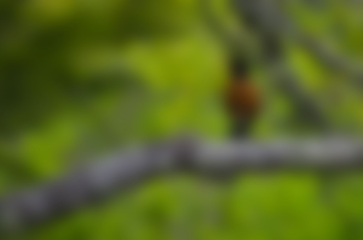
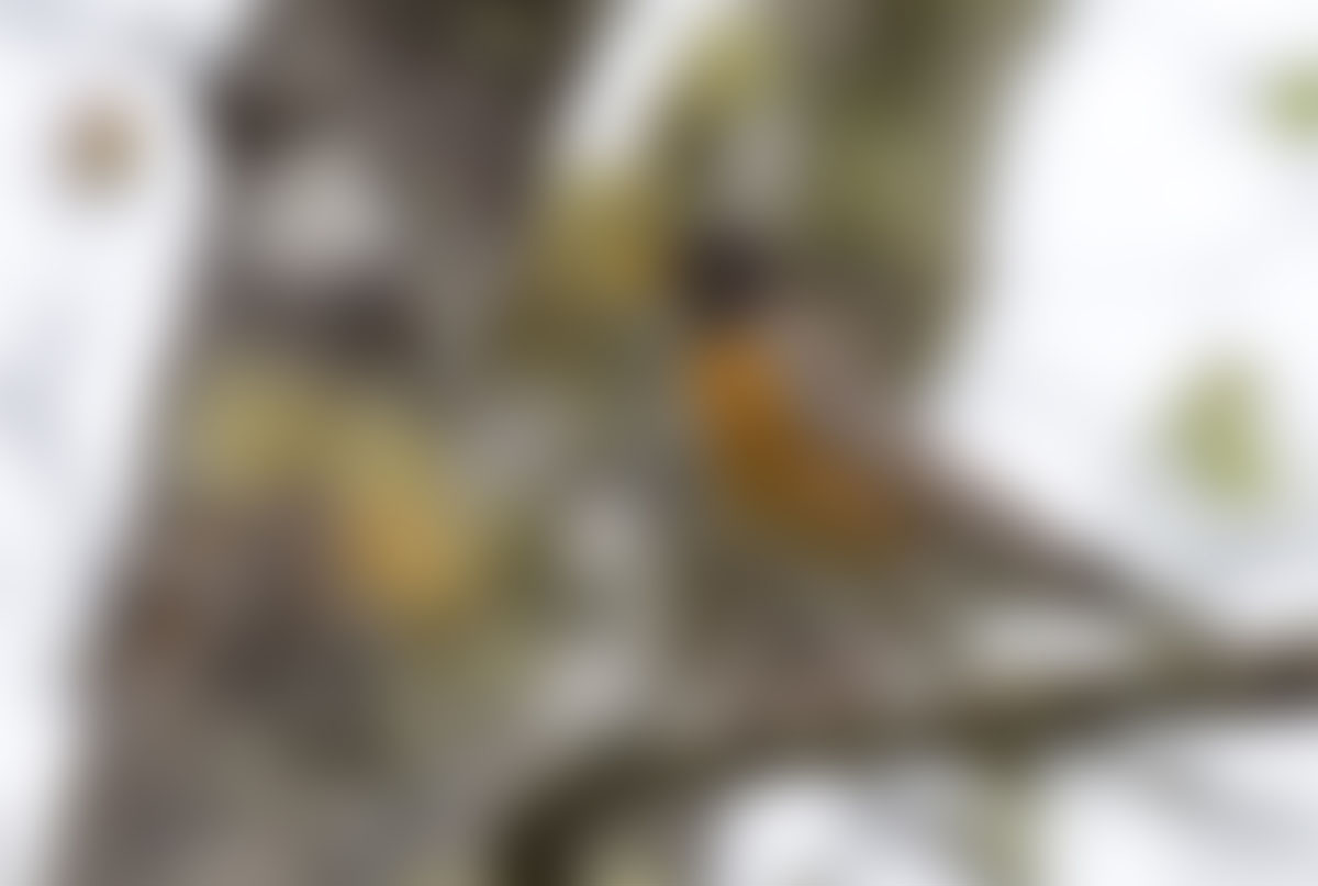
You can see how the first image has a very clear point of interest, whereas the second image is less compelling, and it’s hard to even tell if the robin’s the subject or just another piece of moss.
Complementary colours are perhaps the easiest to remember and most dramatic in implementation. But there are other parts of colour theory that can be useful to bird photography. Analogous colours are adjacent to one another on the colour wheel - an image with only similar colours can be visually interesting.
Check out this image of a chickadee below.
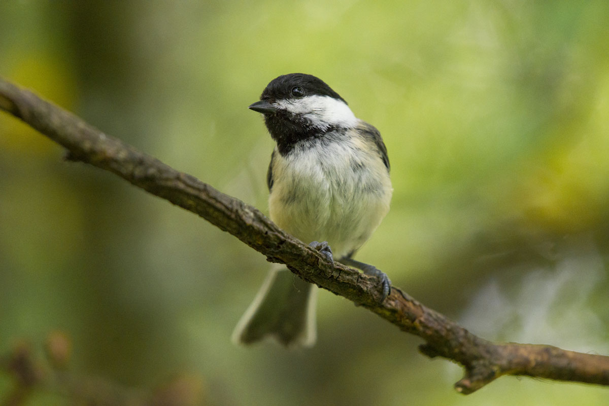
Initially, it might be hard to tell that this is an analogous colour scheme. But when we blur it a bit, it’s clear that the only colours are green, yellow, and orange - all colours that are beside each other on the colour wheel.
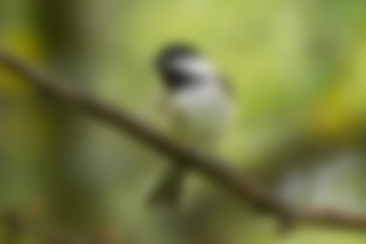
This is great for birds without too much colour. They’ll typically pick up some of the colour of their environment from reflections, and provided there’s some luminosity contrast to separate them from the background the harmonious colour scheme will be very pleasing to the eye.
There are a variety of other colour schemes, like triadic, split-complementary, and tetradic colour schemes. I don’t tend to encounter these in nature too much, but if you’ve mastered the simpler colour schemes and want to step things up a level I’d definitely encourage you to look into the other colour schemes so that if you do get the opportunity to use them you can make the most of it.
If you want to read up on the colour wheel and basic colour theory, this is a great article.
Now that you know what to look for in colour, you can actively seek out good colours in your bird photography by tailoring your photography choices to your subjects and environments. If you’re shooting vibrant red cardinals, you might attempt to photograph them in the late spring or summer, in the midst of trees for that red and green colour contrast. With a goldfinch, you might be best off looking for a green background as well, for an analogous colour scheme, unless you can find enough purple flowers to work as the backdrop of a complementary scheme.
In the winter, you may not have much colour at all. Brown branches and white snow don’t make for very interesting colour combinations, so look for vibrant birds that will really be able to stand out against the austere background. Less colourful birds will work better with more vibrant backgrounds, so perhaps look for them in the spring, summer, and fall instead.
Of course, with all that said, you don’t need a great colour scheme to get a great photo. Birds are interesting subjects, and we’ll find pretty much any bird photo interesting. If you want to maximize the impact of your shots and set yourself up for the best possible opportunities though, a little colour theory can go a long way.
Get the free guide to learning photography faster by signing up to the email list here!
Lauchlan Toal is the creator of UnlockCreativePhotography.com, and a Halifax based food photographer. Outside of food photography, he enjoys most genres, finding fun in any kind of photography challenge.